Performance improvements for pages
Using next/image for image optimization
The Next.js Image component, next/future/image or next/image, is an extension of the HTML <img> element, evolved for the modern web. It includes a variety of built-in performance optimizations to help you achieve good Core Web Vitals.
It helps lazy-load images, which can significantly improve speed for our page as we won't be fetching all images at once.
Here's an example :
  <Image
    className="m-auto mt-4 w-[124px]"
    alt="rating"
    src="https://www.powrcdn.com/PaaP_LandingPage/rating.webp"
    loading="lazy"
    loader={contentfulImageLoader}
    height={124}
    width={21}
  />
We can also add the priority or eager loading property to the image that will be the Largest Contentful Paint (LCP) element for each page. This allows Next.js to prioritize the image for loading (e.g. through preload tags or priority hints), leading to a meaningful boost in LCP.
  <Image
    className="w-full h-full grid items-center bg-contain xl:bg-cover bg-fixed bg-no-repeat object-contain xl:object-cover object-left-top"
    src="https://www.powrcdn.com/PaaP_LandingPage/images/hero_img_new.webp"
    alt="hero-img"
    layout="fill"
    loading="eager"
    loader={contentfulImageLoader}
  />
- Device Sizes
If you know the expected device widths of your users, you can specify a list of device width breakpoints using the deviceSizes property in next.config.js. These widths are used when the next/image component uses sizes prop to ensure the correct image is served for user's device.
- Image Sizes
You can specify a list of image widths using the images.imageSizes property in your next.config.js file. These widths are concatenated with the array of device sizes to form the full array of sizes used to generate image srcsets.
module.exports = {
  images: {
    deviceSizes: [640, 750, 828, 1080, 1200, 1920, 2048, 3840],
    imageSizes: [16, 32, 48, 64, 96, 128, 256, 384],
  },
}
Example of how image is with srcset, can be viewed by inspecting the image -
<img alt="POWR logo" srcset="https://www.powrcdn.com/PaaP_LandingPage/logo_light.webp?w=128 1x, https://www.powrcdn.com/PaaP_LandingPage/logo_light.webp?w=256 2x" src="https://www.powrcdn.com/PaaP_LandingPage/logo_light.webp?w=256" width="102" height="25" decoding="async" data-nimg="future" class="w-[102px] h-auto" loading="eager" style="color:transparent">
https://beta.nextjs.org/docs/optimizing/images
Using next/script for optimizing scripts
The Script component, next/script, allows you to optimally load third-party scripts anywhere in your Next.js application. It is an extension of the HTML <script> element and enables you to choose between multiple loading strategies to fit your use case.
  import Script from "next/script";

  <Script
    strategy="afterInteractive"
    src={src}
  />
It provides us with some loading mechanisms :-
Examples of scripts that should be loaded as soon as possible with beforeInteractive include:
- Bot detectors
- Cookie consent managers
Examples of scripts that are good candidates for afterInteractive include:
- Tag managers
- Analytics
Examples of scripts that do not need to load immediately and can be fetched with lazyOnload include:
- Chat support plugins
- Social media widgets
https://beta.nextjs.org/docs/optimizing/scripts
Using next/link for prefetching and client-side navigation
<Link> is a React component that extends the HTML <a> element to provide prefetching and client-side navigation between routes. It is the primary way to navigate between routes in Next.js.
https://beta.nextjs.org/docs/api-reference/components/link
Load content you’ll need later in advance
Loading assets on a page is an important part of achieving optimal web performance and a seamless user experience. Usually, real world apps load multiple CSS, font, JavaScript, and image files. These assets are render-blocking by default, which impairs loading performance
preload – when you’re going to need a resource in a few seconds.
prefetch – when you need a resource for the next page.
preconnect – when you know you’ll need a resource soon, but you don’t know its full url yet.
dns-prefetch – when you know you’ll need a resource soon, but you don’t know its full url yet (for older browsers).
Example - <link rel="preconnect" href="https://fonts.googleapis.com" />
https://nitropack.io/blog/post/resource-hints-performance-optimization
Use image CDNs to optimize images
Image CDNs specialize in the transformation, optimization, and delivery of images. In order improve page load times, CDNs reduce overall data transfer amounts between the CDN's cache servers and the client.
Use webp format images
WebP is a type of encoding that compresses image files in order to help them load faster. Files will be up to 34% smaller once compressed and will download for the user more quickly, enhancing their experience.
https://webflow.com/blog/webp-images
Using next/dynamic for lazy loading external libraries with import() and React components
next/dynamic is a composite extension of React.lazy and Suspense, components can delay hydration until the Suspense boundary is resolved. Components or libraries are only imported and included in the JavaScript bundle when they're used.
Here's an example :
import dynamic from "next/dynamic";

const Accordion = dynamic(() => import("./Accordion"));
https://nextjs.org/docs/advanced-features/dynamic-import
Remove unused javascript
Reducing unused JavaScript can reduce render-blocking behaviour to speed up your page load and improve your visitors' page experience. Loading unused JavaScript can therefore have a heavy impact on your page performance, both, measured and perceived. For example, we can remove unused imports or importing the necessary things from library instead of loading everything.
https://gtmetrix.com/reduce-unused-javascript.html
Lazy loading component of a page
In a normal scenario when the user initially loads the page all the content of the page will be loaded, however, sometimes users do not care what’s at the bottom of the page and do not bother to scroll. So loading all content will be in vain.
By using lazy loading we render content on demand of the user, so when the user scrolls down we load the content gradually, not during the initial rendering of the page.
Reference can be found in -
Added a custom hook components/shared/use_on_screen.js in static repo, with the help of IntersectionObserver to detect the visibility of a particular component while the user is scrolling.
Implemented in components/one/index.jsx component to lazy-load <Schedule /> component to lazy load calendly as its not required in initial viewport.
Reduce unused css
Unused css classes can be removed. We can also check coverage by using command cmd + shift + p in console and then selecting show coverage option to view coverage of js and css.
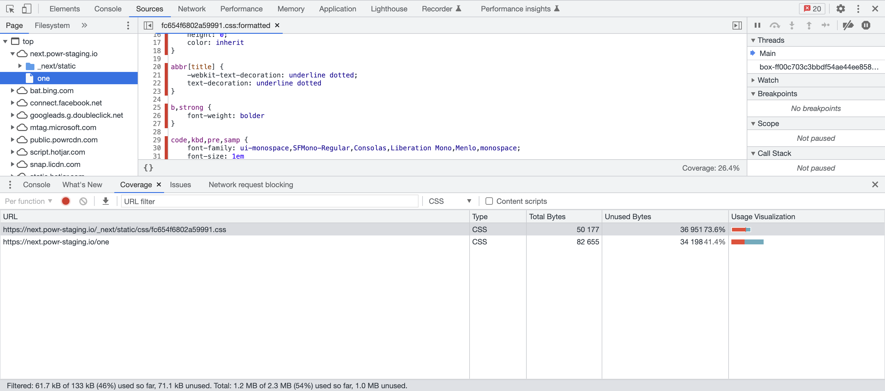
The red area shows unused css, but we need to be careful while removing this as this css may not be used on the page that you are viewing, but might have some use on other pages.
I have added a package react-device-detect to detect on which device the application is running, with the help of this we can decide which component to load and which to not depending on there requirements on different devices. For example, we have a component which is only viewed on mobile devices, for this we can use the package so that it doesn't load unecessary css for desktop view.
Here's an example :
import { isMobile } from "react-device-detect";

{isMobile && <SomeComponent />}
Add title and description for page in HEAD element
Add a title to page in nextjs HEAD element for better SEO. Ensure that the document's title contains short, descriptive text summarizing the page's contents.
Here's an example :
  <HEAD>
    <title>POWR One</title>
    <meta name="description" content="POWR One" />
  </Head>
https://dequeuniversity.com/rules/axe/4.4/document-title?utm_source=lighthouse&utm_medium=devtools